What Color to Paint a Small Room with Little natural Light
A definitive guide on what color to paint a small room with little natural light. Discover paint illusions and techniques to make your space look bigger.
The Ultimate Guide to Painting a Small Room to Make It Look Bigger
There is perhaps no greater design challenge in a small home than the room that feels like a cave. You know the one—it has one small window, or it faces the wrong direction, and it seems to swallow every bit of light that dares to enter. As a small space expert and the founder of Neat Tiny Home, this is a puzzle I’ve helped countless people solve. The most common question I hear is, without a doubt, what color to paint a small room with little natural light? It’s a question loaded with the weight of old, outdated design “rules” that have led so many people astray. For years, the conventional wisdom has been to simply blast the room with the brightest, starkest white you can find. But I’m here to tell you that this is often the worst thing you can do.
This guide is my definitive answer to that crucial question. We are going to dismantle the myths and give you a real, practical framework for choosing colors that actually work. This is more than just a list of paint chips; it’s a deep dive into the science and art of color theory, light reflection, and perception. We’ll explore a palette of beautiful, effective colors that go far beyond basic white. We’ll uncover powerful paint color illusions and specific small room painting techniques that can trick the eye and make your room feel airy, bright, and expansive. My mission is to empower you with the confidence to pick up a paintbrush and transform that dark, cramped space into a room you genuinely love to be in. Let’s illuminate the possibilities.
The Science of Perception: How Light and Color Create Space
Before we can answer the question of what color to paint a small room with little natural light, we must first understand the “why.” Why do some colors make a room feel like a cozy jewel box, while others make it feel like a sterile, gloomy closet? The answer lies in the physics of light and the psychology of color. Every color you see is simply a reflection of light. In a room with very little natural light to begin with, the behavior of that limited light is incredibly important. The color you put on the walls becomes the single most influential factor in managing and maximizing that precious resource. It dictates whether the light is absorbed, making the room feel smaller, or reflected, making it feel larger and brighter.
Understanding LRV (Light Reflectance Value): Your Secret Weapon
This is the most important technical concept you need to know. Every paint color has a Light Reflectance Value, or LRV, on a scale of 0 (absolute black) to 100 (pure white). This number tells you exactly how much light a color reflects. A color with an LRV of 75 will reflect 75% of the light that hits it, while a color with an LRV of 10 will absorb 90% of the light. You can find the LRV on the back of most paint chips or on the paint manufacturer’s website, like Sherwin-Williams or Benjamin Moore. For a small, dark room, the conventional wisdom is to choose colors with a high LRV, typically 60 or above. While this is a good general guideline, it’s not the whole story. The *quality* of the light and the undertones of the paint are just as important as the LRV, which is why a stark white (LRV of 90+) can sometimes fall flat.
The Psychology of Warm vs. Cool Colors in a Confined Space
Beyond the physics, there’s the psychology. Colors have a profound effect on our perception of space and our mood.
- Cool Colors (Blues, Greens, Cool Grays): These are known as “receding” colors. They tend to trick the eye into thinking a surface is further away than it actually is. This is why a very soft, light blue can make a small room feel airy and expansive, like the open sky.
- Warm Colors (Reds, Oranges, Yellows, Warm Whites): These are “advancing” colors. They tend to feel like they are coming toward you, which can make a space feel cozier and more intimate, but also potentially smaller if the color is too saturated.
Dethroning Stark White: Why It Fails in Low-Light Rooms
The biggest mistake I see people make is following the old advice to paint a dark room pure, builder-grade white. The logic seems sound: white reflects the most light, so it should make a dark room bright, right? Wrong. In a room with little natural light, a stark, cool-toned white has no beautiful, warm sunlight to reflect. Instead, it reflects the dull, gray light of the shadows. The result is a room that doesn’t feel bright and airy; it feels flat, lifeless, and dingy. The corners can look gray and dirty, and the overall effect is more like a sad, sterile box than a welcoming space. This is the critical nuance in answering what color to paint a small room with little natural light—the quality of the reflection matters more than the quantity.
The Best Colors to Paint a Small Room with Little Natural Light
So, if stark white is out, what’s in? The answer is colors that have enough depth and warmth to create their own luminosity, without relying on direct sunlight. We are looking for colors that glow, not just reflect. Here are my go-to categories that work beautifully in challenging spaces.
| Color Family | Psychological Effect | Best For |
|---|---|---|
| Warm Off-Whites & Creams | Cozy, inviting, luminous | Creating a warm glow where there is no sun. |
| Soft, Muted Pastels | Airy, serene, sophisticated | Adding a hint of color that recedes and feels spacious. |
| Light, Earthy Greens & Blues | Calm, natural, expansive | Bringing a sense of the outdoors in and making walls recede. |
| Deep, Moody Hues | Dramatic, cozy, infinite | Embracing the darkness to create a cozy, jewel-box effect. |
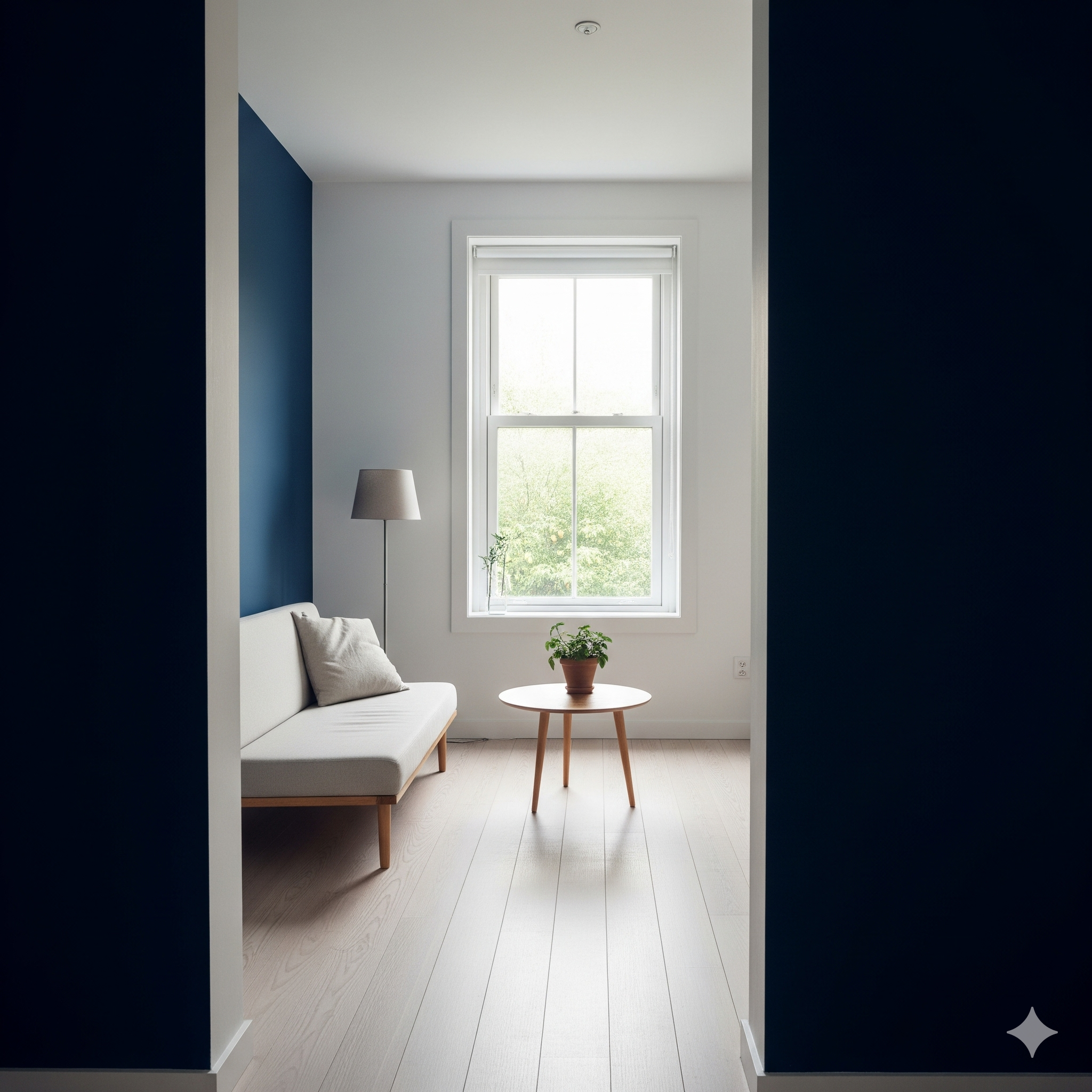
The Counter-Intuitive Strategy: Going Dark and Moody
This is my favorite trick and one that feels daring but delivers stunning results. Instead of fighting the darkness, embrace it. Painting a small, dark room a deep, saturated color like charcoal gray, navy blue, or even a rich forest green can be magical. This is one of the most powerful paint color illusions. The dark color absorbs the light and blurs the hard edges and corners of the room. This makes it difficult for your eye to tell where one wall ends and another begins, creating a sense of infinite depth and coziness. The room transforms into an intimate, dramatic jewel box. This strategy works best when you commit to it—painting the trim and even the ceiling in the same color for a truly immersive, sophisticated look. For inspiration on using dark paints, I love looking at the work of designers like Abigail Ahern, a true master of the moody interior, whose work is often featured in magazines like Elle Decor.
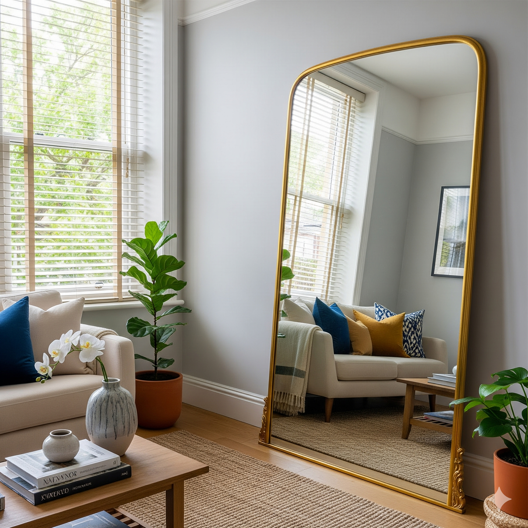
Beyond Color: Small Room Painting Techniques to Trick the Eye
The color you choose is only half the battle. How you apply the paint can have just as much of an impact on the perception of space. By using clever small room painting techniques, you can visually stretch the walls, lift the ceiling, and make your room feel significantly larger and more dynamic. These are the pro-level tricks that interior designers use to manipulate a space, and they are surprisingly easy to implement yourself. Let’s explore some of my favorite techniques for creating powerful paint color illusions.
The Power of Sheen: Why Matte is Not Your Friend in a Dark Room
Paint comes in different finishes, or sheens, ranging from flat/matte to high-gloss. In a room with little natural light, the sheen is incredibly important. A matte finish absorbs light, which can make a room feel flat and even smaller. A finish with a bit of a sheen, on the other hand, will reflect light around the room.
- Eggshell: Has a very low sheen and is a good step up from matte. It’s durable and easy to clean.
- Satin: This is my go-to for small, dark rooms. It has a beautiful, soft glow that gently bounces light around the room without being overly shiny.
- Semi-Gloss: Has a noticeable shine and is extremely durable. It’s excellent for trim, doors, and bathrooms, as it reflects a lot of light and is very easy to clean.
Techniques for the Ceiling: Painting It for Maximum Height
Most people default to painting their ceiling “ceiling white,” but this can sometimes create a harsh, contrasting line that visually lowers the ceiling. Here are a few better options for a small room:
- Paint it the Same Color as the Walls: This is a key part of the “color drenching” technique. By erasing the boundary between the walls and ceiling, you create a seamless, expansive look that makes the room feel taller. This works beautifully with both light and dark colors.
- Paint it a Lighter Tint of the Wall Color: Ask the paint store to mix a version of your wall color with 50% white. This creates a subtle, harmonious transition that gently lifts the eye upward without a jarring contrast.
Your Step-by-Step Guide to a Flawless Paint Job
You’ve chosen your perfect color and your clever techniques. Now it’s time to execute. A professional-looking result is all in the preparation. Rushing this stage will lead to a messy, amateurish finish, no matter how beautiful your color is. Taking the time to prep properly will ensure crisp lines, a smooth surface, and a durable finish that you can be proud of.
Gathering Your Supplies
Before you begin, gather everything you need. There’s nothing worse than having to run to the store mid-project. You’ll need: painter’s tape, drop cloths, spackle or wood filler for holes, a sanding sponge, high-quality paint brushes (an angled one for cutting in is essential), a paint roller with an extension pole, a paint tray, and of course, your primer and paint. Don’t skimp on your tools! A good quality brush and roller cover will make a huge difference in the final look.
The Non-Negotiable Prep Work: Cleaning and Patching
First, move everything out of the room or to the center and cover it with a drop cloth. Then, clean your walls. Dust, cobwebs, and grime can prevent the paint from adhering properly. A simple mixture of water and a little bit of dish soap on a sponge works perfectly. Next, fill any nail holes or cracks with spackle. Once it’s dry, sand the patches smooth with your sanding sponge until they are flush with the wall. Finally, apply your painter’s tape for those super-crisp lines along the trim, ceiling, and floor. For a great tutorial on wall prep, check out the guides on home improvement sites like This Old House.
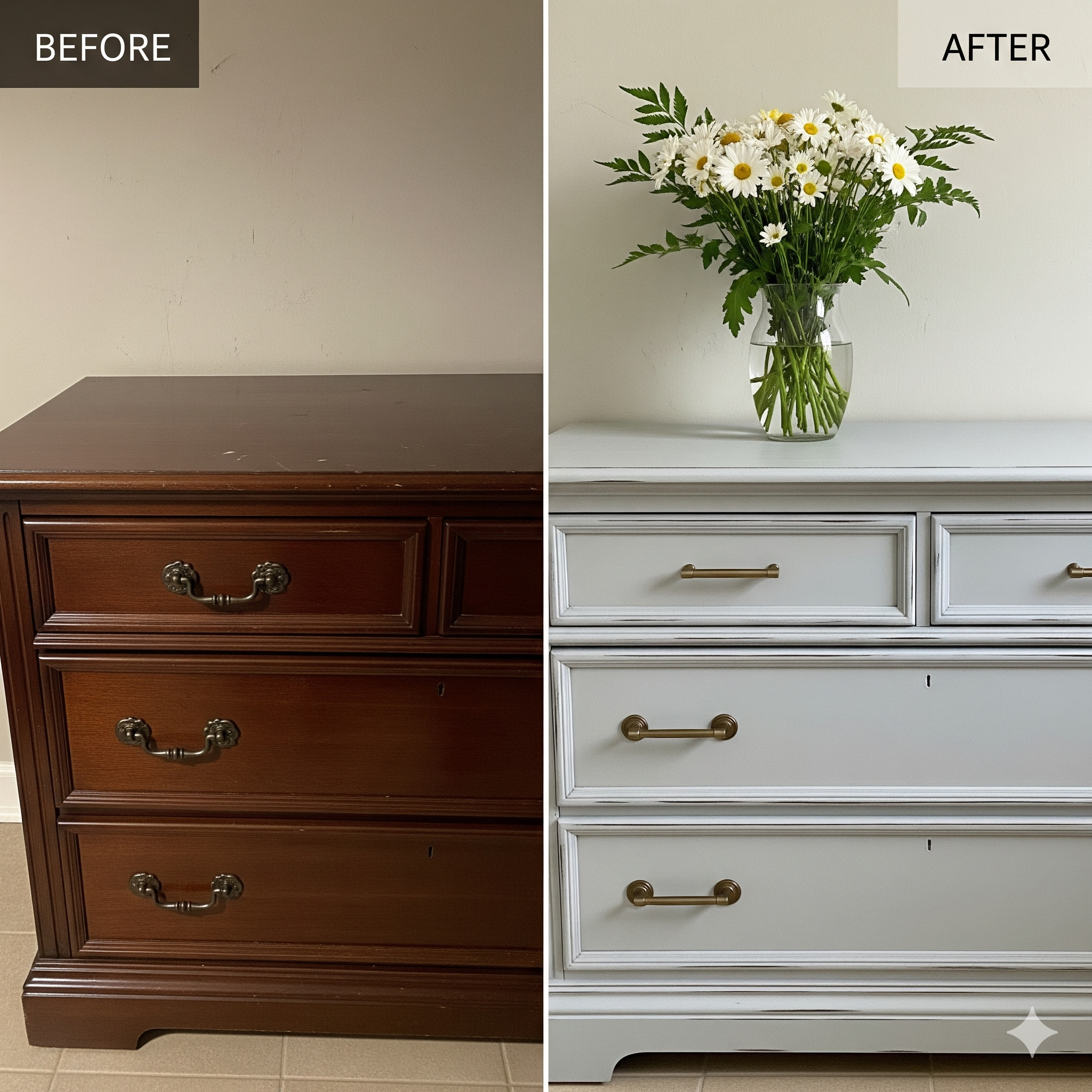
Painting is one of the most transformative and budget-friendly things you can do to change a space. By moving beyond outdated rules and embracing the nuanced relationship between color, light, and perception, you can turn even the smallest, darkest room into a bright and beautiful sanctuary.
Frequently Asked Questions (FAQ)
Should I use cool or warm light bulbs in a small, dark room?
This is a fantastic question because artificial light is crucial! It depends on the paint color. If you’ve chosen a cool-toned color (like a soft blue or gray), a cool or “daylight” LED bulb will complement it and feel bright and clean. If you’ve chosen a warm off-white or a deep, moody color, a “soft white” or “warm white” bulb will enhance its coziness and prevent it from feeling sterile. Always test your paint swatch with the room’s actual lighting before committing!
What about an accent wall? Is that a good idea for a small room?
I generally advise against a traditional, high-contrast accent wall in a small, dark room. It can often chop the room up and make it feel even smaller by drawing attention to one wall’s proximity. A more modern and effective approach is “color drenching” or a monochromatic scheme, where you paint the walls, trim, and even the ceiling the same color. This creates a seamless, expansive feel that is much more sophisticated.
How many paint samples should I test before I decide?
I recommend narrowing your choices down to your top 2-3 colors. Buy sample pots of each and paint large swatches (at least 2×2 feet) on different walls in the room. Live with them for a few days. Observe how they look in the morning, at noon, and at night with your artificial lights on. The color that looks best in all these different lighting conditions is your winner. Never, ever choose a color based on the tiny paint chip in the store!

Post Comment